The purpose of this lab is to determine which parts of the ground are pervious and which are impervious using an online tutorial provided by ESRI that uses ArcGIS Pro. Throughout the activity images will be put into land-use types, comparing man made structures such as buildings and roads to natural surfaces including water or vegetation. The data used in this exercise is provided from the local government of Louisville, Kentucky. The map provided is a small neighborhood near Louisville and the map has 6 inch resolution. In this lab some steps will be laid out that were used to complete the tutorial along with screenshots that illustrate what was being done. Going into this lab it is important to understand what pervious and impervious means. Pervious means that it is permeable, or that water has the ability to pass through. In contrast impervious means that it is not permeable, or that water can not pass through it.
Methods
Lesson 1
The first step is extract the bands from the raster, the goal here is to end up with three bands. The three bands being extracted are ones that are used to differentiate between impervious and pervious. Those bands are the red which is band 1, blue which is band three and near infrared which is band four. The red band shows man made objects and vegetation, the blue band shows water and the near infrared band also emphasis vegetation.
 |
| Figure 1 |
Figure 1 above shows the map after the three bands discussed about were extracted and the parcels layer was turned off. Figure 2 below shows the initial set up, though the combination shown is bands 1, 2, and 3 rather than the 4, 3, 1 that was used.
 |
| Figure 2 |
 |
| Figure 3 |
 |
| Figure 4 |
Lesson 2
 |
| Figure 5 |
 |
| Figure 6 |
 |
| Figure 7 |
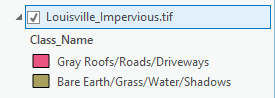
Figure 7 to the right is the illustration that goes with figure 6. Each of the different types of land uses are very prominent and clearly visible. Thought this rough classification is not always completely correct it is what is used to figure out how much landowners will pay in regards to storm water fees. In figure 7 there is 7 land use types, the end goal is to get them into 2 land use types as shown in figure 9. To do this the reclassify tool was used and the impervious surfaces received a 0, while the pervious surfaces received a 1. Figure 9 shows a clear representation of whether or not the areas are Impervious or not impervious. The pink represents the roads, driveways and roofs, and the brown shows the bare earth, grass and shadows.
 |
| Figure 9 |
 |
| Figure 8 |
 |
| Figure 10 |
 |
| Figure 11 |
 |
| Figure 12 |
Results
Figure 13 and figure 14 are two different maps that were derived from the aerial imagery that was processed using ArcGIS Pro. Figure 13 shows one of the end displays that shows what areas are impervious, as depicted by the brown and what areas are pervious, as depicted by the neon green. When looking at this alone a viewer would be able to tell that the area is a suburb. The lake is slightly unclear in figure 13, though it stands out really well in figure 14. Figure 13 is a good add on map to use with with other illustrations to help people to understand what areas absorb water and what areas do not.
 |
| Figure 13 |
Figure 14 below clearly illustrates the differences in land use, this is done to give the viewer an opportunity to see what structures are in what places in relation to figure 13. Figure 14 clearly shows the lake in the center of the housing area. Then, breaking up the map into quadrants, there is an almost even distribution of structures or vegetation and each quadrant has a bit of water in it. There are a few large shadows denoted, that most likely are coming from trees. This is a good map to couple with figure 13 because the viewer will clearly be able to tell what is pervious and what is impervious.
 |
| Figure 14 |
Conclusion
In closing, this lab was very informative and a really good beginning tutorial on how to use ArcGIS Pro. Aerial imgagery is very effective in finding out what areas are impervious and pervious to water. This was an important lab because what was done could be done by any city or government in an effort to better determine storm water bills. ArcGIS Pro online was much faster than expected and it looks to have a promising future in the geography field.
Sources
https://learn.arcgis.com/en/gallery/
https://learn.arcgis.com/en/projects/calculate-impervious-surfaces-from-spectral-imagery/
https://learn.arcgis.com/en/projects/calculate-impervious-surfaces-from-spectral-imagery/lessons/segment-the-imagery.htm
No comments:
Post a Comment